My plasters project is being handed in in a weeks time and I'm trying to get my marketing in place. I need as much crit and feedback as I can get to do some alterations before printing on Saturday/Sunday so please help!
The original product can be found on this post: Swift Plasters and the target audience is mothers as it is a convenience product ideal for the handbag and so treating kids falling over can be done quickly without fuss.
1. Girls print ad for magazines
Been having some trouble with the type placement here, and debating whether or not to try and delete the shadow on Photoshop:
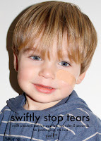
2. Boys Print ad for magazines
Thinking about making the text white for cohesion and so having to try and get rid of the stripes on his top using photoshop...

Spent this morning editing this - taking out the stripes seemed the easiest option to make the text white then cropped in a little more to get rid of the edge of the texty/sewn on section on his top in the left hand corner (without the stripes this looked plain odd and trying to edit it out it looked very obviously edited.I think this is going to be the final print unless anyone points out a mistake!
3. Automatic Doors Large Format Display at Points of Purchase (they simulate the action of removing the plaster by pulling...) In situ and Illustrator simulation
I am going to be HUGELY grateful for ANYTHING I can amend or advice on the queries and indecision I have mentioned.


The sainburys one is great :)
ReplyDeleteThe shadow - maybe not delete the whole thing - it needs something to give it context. Maybe instead of a dark grey it could be a darker shade of the creamy background so it's not so dominating? Hmmmm, just an idea.
ReplyDeleteI think you're right hannah, I might try just fading it slightly so it's less in your face.
ReplyDeletei also agree with the creamy shadow thing, and i love the door thing, that works really well.
ReplyDeletemaking the text white on the boys poster would look really good i think, but maybe the stripes would get in the way of it so you could try it without them? if you cant do that though it still works nicely how it is!
i think theyre really good! but maybe make the plasters a bit darker in colour? at first glance it is a little hard to realise the kids are wearing them, its quite close to their skin colour.
ReplyDeletebut other than that its really impressive....looks v.proffessional
and the baby looks a bit like baby ben
love!
S
xxx